The Evolution of COVID-19 | Web, Data Visualization
︎︎︎website
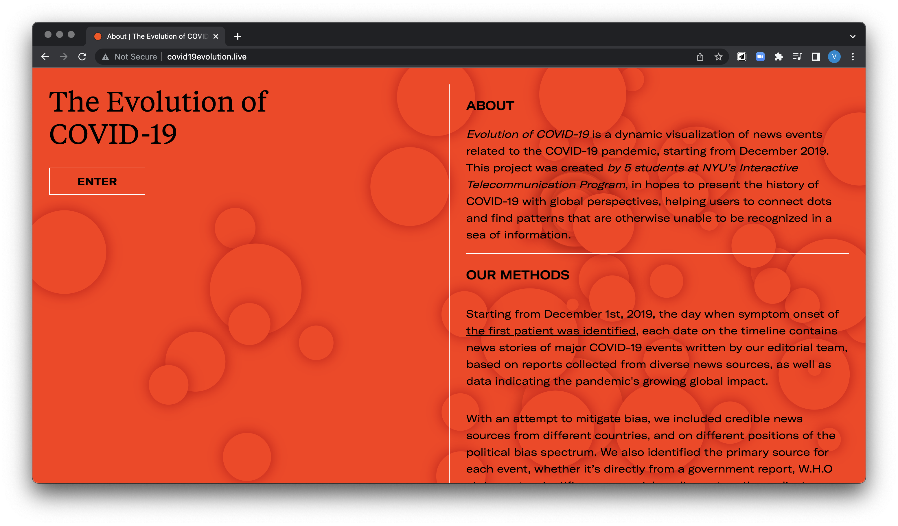
The Evolution of COVID-19 is a web-based interactive timeline that visualizes the development of the COVID-19 pandemic, putting numbers into perspectives with events and news stories around the world since its start in December, 2019. The project is created in hopes to present this global health crisis as a historical event and provide verified, credible, and accessible information for the general public. With a dynamic and customizable interface, users are encouraged to connect dots and find patterns that are otherwise unable to be recognized in a sea of information.
︎︎︎website
The Evolution of COVID-19 is a web-based interactive timeline that visualizes the development of the COVID-19 pandemic, putting numbers into perspectives with events and news stories around the world since its start in December, 2019. The project is created in hopes to present this global health crisis as a historical event and provide verified, credible, and accessible information for the general public. With a dynamic and customizable interface, users are encouraged to connect dots and find patterns that are otherwise unable to be recognized in a sea of information.
︎︎︎ Team: Huiyi Chen, Viola He, Rui An, Emily Lin, Qice Sun
︎︎︎ Role: Researcher, Editorial Lead, UI/UX Designer
︎︎︎ Role: Researcher, Editorial Lead, UI/UX Designer
Context
Spring 2020, shortly after New York went into quarantine, Huiyi, Rui and I entered a 3-day virtual hackathon with the theme Hack Against COVID-19. As Chinese students living in the US, we spent a lot of time reading news articles in both mandarin and English, trying to understand how we got to where we were. We wanted to address our anger, frustration and confusion searching for answers in an overwhelming ocean of information, and decided to create an interface to navigate the development of the pandemic and its cultural implications as a global event.
After presenting a prototype at the hacakthon, we had two other teammates on board to help with design iteration and development.
Designing system & interfaces
We identified two key issues:
Our solutions:
Spring 2020, shortly after New York went into quarantine, Huiyi, Rui and I entered a 3-day virtual hackathon with the theme Hack Against COVID-19. As Chinese students living in the US, we spent a lot of time reading news articles in both mandarin and English, trying to understand how we got to where we were. We wanted to address our anger, frustration and confusion searching for answers in an overwhelming ocean of information, and decided to create an interface to navigate the development of the pandemic and its cultural implications as a global event.
After presenting a prototype at the hacakthon, we had two other teammates on board to help with design iteration and development.
Designing system & interfaces
We identified two key issues:
- Information overload - having an overwhelming amount of information and data, and not knowing how to navigate.
- Misinformation and news bias - understanding a global crisis in an extremely polarized political environment makes it harder to mitigate media bias and misinformation circulating on social media.
Our solutions:
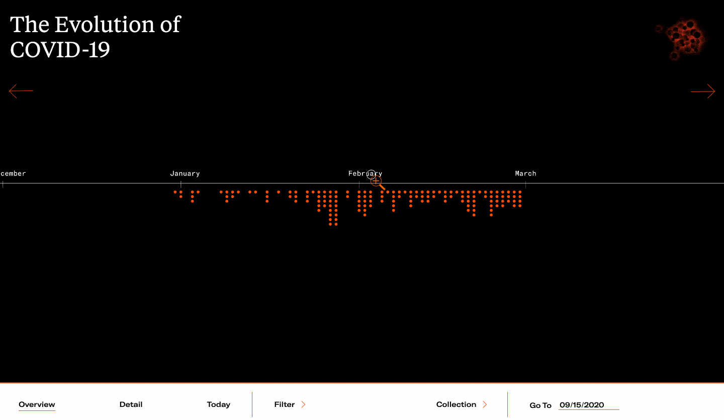
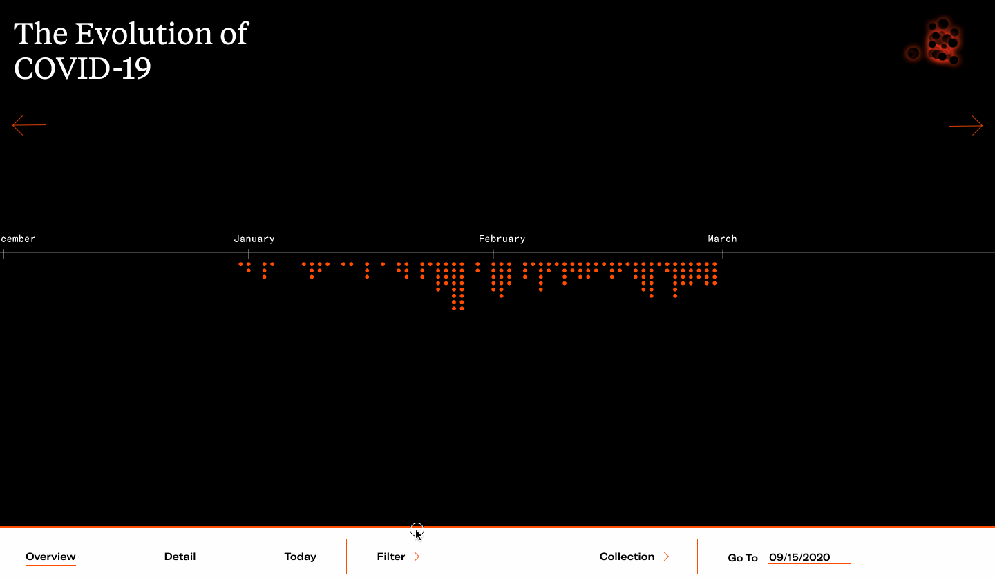
- Allow users to browse the timeline contents in various levels of resolution, organizing information with visual hierachy.
Upon entering, user land on the overview page. Click anywhere on the timeline, or use the navication bar on the bottom to zoom into detail view and day view.
- Filter information by location or event type, or browse topics of interest in Collections curated by our team.
- Link to diverse news coverage, as well linking to the most direct source for every entry.
Click an event to see its detailed descriptions. Each event card includes editorial notes, tags, links to primary sources, and links to news coverages from credible media* sources.
* See our research on media credibility

- Enforce a rigorous peer-review method for data collection and editorial copies, and be transparent about our research on the website.

Development
- We used Invision inspection to facilitate design + developer handover.
- We created a data entry interface to input news data into database after we finished editing and reviewing.
- Backend and database are built on MangoDB.
- Frontend is built with React.js + Three.js.